
With the release of the iPad Pro we as designers (or do-it-yourself creators) have yet another screen resolution to deal with.
Fortunately, the Divi theme is already pretty great at accounting for many of the most common screen sizes but it seems that the team over at Elegant Themes haven’t quite gotten around to updating Divi for the iPad Pro.
But fear not! This quick fix should straighten your Divi site right up and make it look as good on the iPad Pro as it does on other screen sizes.
The Problem
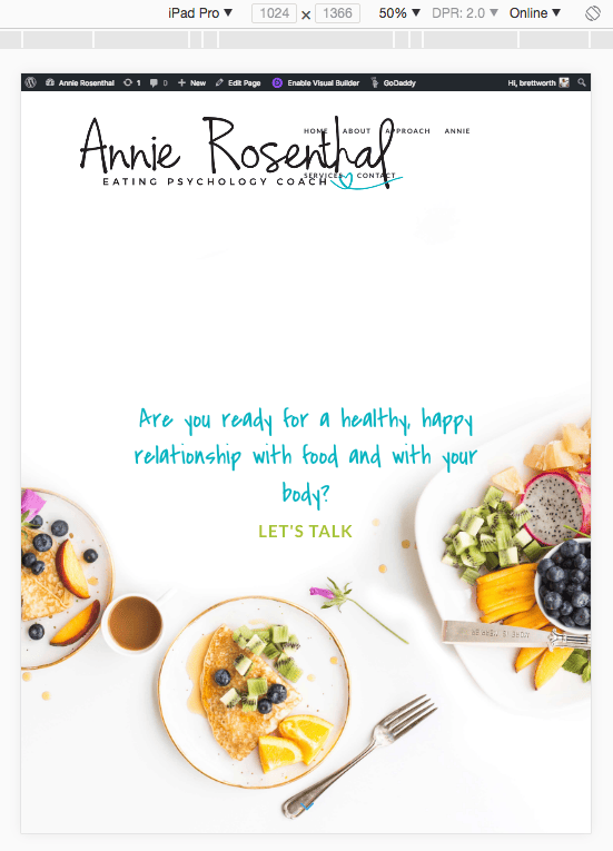
The main issue when it comes to Divi and the iPad Pro is the main menu: it simply doesn’t collapse when it should do and you end up with some weird overlap. It looks something like this:
The Solution
What we need to do is to tell our theme that when the browser detects an iPad Pro screen resolution it should display the mobile menu.
/* iPad Pro Menu Fix */
@media only screen and ( max-width: 1040px ) {
#et_mobile_nav_menu {
display: block;
}
#top-menu-nav, #top-menu {
display: none;
}
}
The Result
The end result should look something like this:
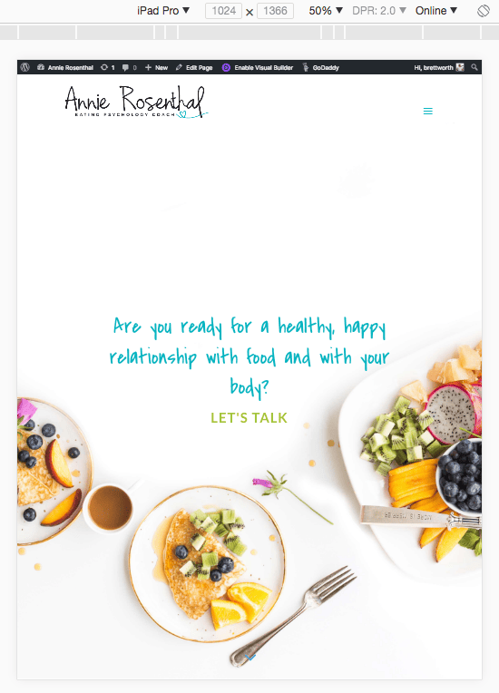
Much better!
Have you noticed anything else wrong with the Divi theme on the iPad Pro? Let me know in the comments and I may be able to help.

Hi Brett
Thanks for this snippet it has fixed my menu on ipad pro but I am still having some issues with my sidebar. Would you have something similar to make sidebar responsive on ipad pro?
Cheers
https://uploads.disquscdn.com/images/b5889cc7180fbf9edf20ffec6d597edcb38c19e1c1285e25db7c49d3df7bdf1a.png
Hi Sandeep! Sorry I must have missed your comment. Did you resolve this? If not feel free to leave your URL and I’ll take a quick look for you.
Hi, nice snippet,i’m having some issues with my woocommerce Product on my Divi themes it is not responsive on my IPad in portrait mode.
Can you check it out my web:
https://econaturaden.com
Thanks
Hi there! I can’t seem to get your URL to work, getting the following error – ‘This site can’t be reached
econaturaden.com’s server IP address could not be found.
DNS_PROBE_FINISHED_NXDOMAIN’
Hi I am facing the same issue with Ipad pro menu bar and footer also.. could you please check it for me too and me help out… URL – test-partnermodel.com
Hi Karan, which iPad Pro is it and at what resolution are you having trouble with? It looks like you’re using several different modules in the menu some other changes to make it work.
https://uploads.disquscdn.com/images/7801b51d7104017e730b30aa7bbc2ee0ebda7bd373912690be12589721b577fc.png https://uploads.disquscdn.com/images/416a02da3f14f881f846a5117e2692d540f67a7c6cac6403c4bad3a43f1eab58.png Hi
I will share the snippet with you
Hi Sir, could you pleae check the screenshot and help me in getting the task done
Hi Karan, it looks like there are a few different things happening here. For example:
1. What are the icons for in the header? Do they need to be that big on tablet?
2. The header icons are missing from mobile, is that intentional? How I would do this would be to add the logos to the menu and make the menu module full width.
2. The issue with the footer appears to be margin/spacing related. Divi should manage this automatically unless you’ve set specific values. If it doesn’t then you’d most likely want to create CSS ID’s for each column or module and then add specific code for iPad Pro resolutions. The fact that the content is as far to the left as it can be though tells me that the spacing is not correct though.
I’m afraid that the site will require a bit of tweaking and design to get it looking correct.
Hi, I tried but it doesn’t work on my site. Is it possible to send you the url?
You could have a different CSS classes for your menu. I had the same.
Thanks a lot. Changed my classes a bit, and it works )